Simplicity New Zealand is a superannuation provider with a difference. Seeking an office that is the opposite of a traditional environment, Simplicity Co-Founder and Managing Director Sam Stubbs approached Donna White of Donna White Interior Design.
“The reason behind this request was to echo, from an interior design perspective, the company’s manifesto – ‘do it differently,’ ‘turn things upside down,’ and ‘money should make smiles, not frowns.’” Explains Donna.
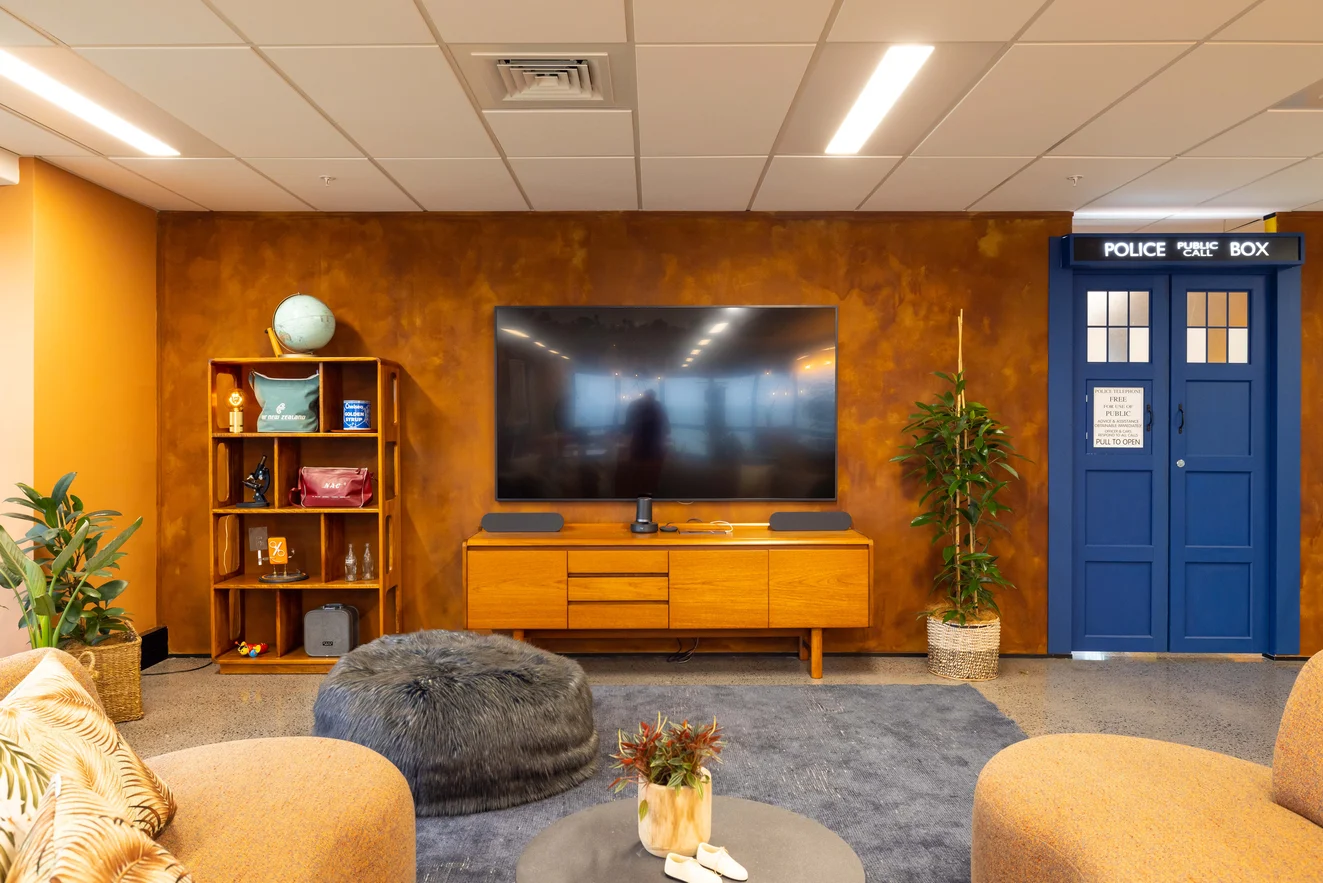
Seeking not only to create an interior with mischievous touches which make visitors smile but one that is also inclusive and respectful of religious beliefs, the space includes a prayer and meditation room. Additionally, the office features a comfortable lounge for informal meetings and relaxation, and a ‘playroom’ – located behind a bespoke replica of Doctor Who’s Tardis – where staff can problem-solve over a game of table tennis and their children can complete homework after school.
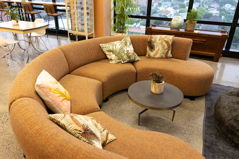
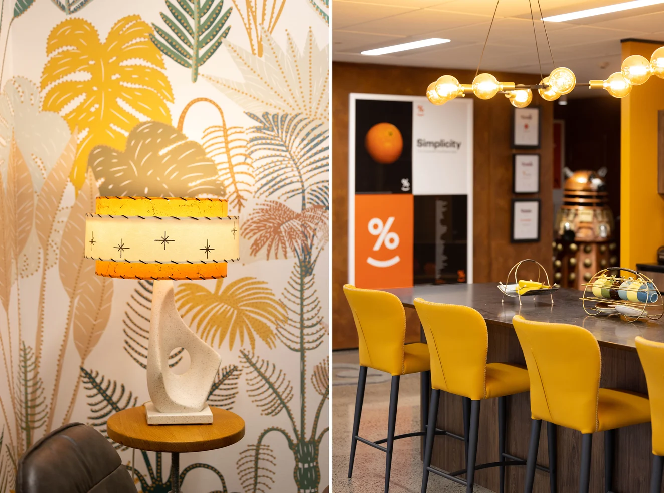
Being a non-profit organisation, the Simplicity ethos is reflected in the sourcing of pre-loved furnishings which when paired with the company’s orange branding and the client’s personal collection of 50s, 60s, and 70s memorabilia, led to the embrace of a retro style.
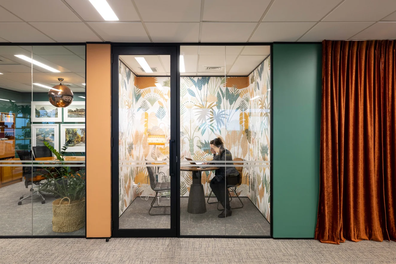
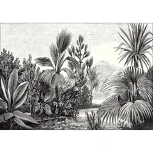
These retro furnishings dictated the wallpaper selection throughout the meeting rooms. Casadeco’s Dreamlike Landscape and Balade Sauvage wall panels provide scenic backdrops to the boardroom and secondary meeting room whilst the more whimsical tropical pattern, Manille by Casadeco, brings the small meeting room to life.
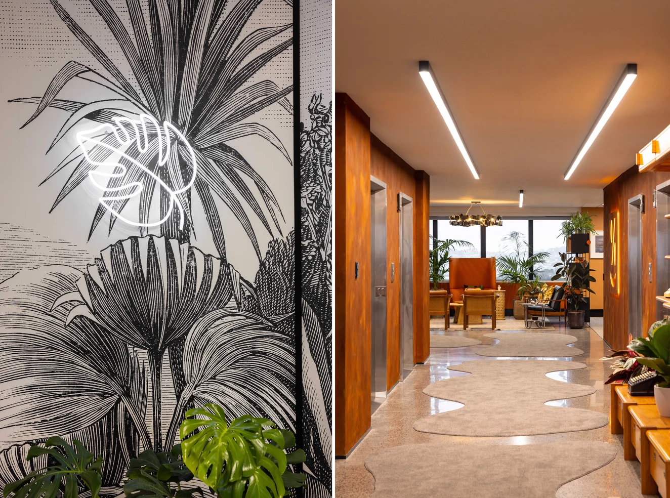
Although Simplicity’s branding is orange, “rather than painting the entrance an ordinary shade, we thought Porter’s rust-effect paint would meet the brief of ‘expect the unexpected.’ Other colours either complement or contrast with orange – most meeting rooms are wallpapered, and the staff locker and meditation rooms are hidden behind brick-red velvet curtains. So, all the colours are rich and intense, and differ from a usual subdued office interior.”