In Use - Project

Tea House

Designed by Kate Pilot of Kanat Studio in collaboration with Ethan Hunter Architect, Tea House is a secondary dwelling to the rear of the client’s section on Auckland’s Te Atatu Peninsula. Sensitively built for the client’s mother who suffers from dementia, the home needed to one day accommodate a full-time carer before eventually being used by the client themselves.

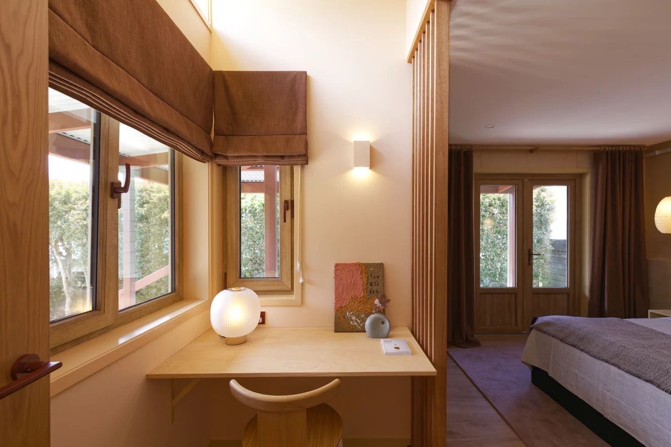
Conceptually, the environment is tailored to enhance wellbeing and spatial functionality through design principles relating to: familiarity, privacy, clarity, the materiality of architectural elements, and wandering paths. Therefore, creating a comfortable environment which felt familiar to the client’s mother was an important consideration. 

The Scoria red colour of the veranda references the landscape of Kuranda, a town in Australia’s rainforest where most of her recent life was spent. For the roof and exterior, “Mist Green was chosen to create a secluded greenhouse in the garden that will eventually be partly overgrown by vines on the trellis end of the building and along the veranda,” says Kate. “It will become part of the gardens and create a full environment within the landscape and back section of suburban Auckland.”

“Research suggests that privacy is the most important part of the environment for older people. If they feel they have privacy and control over their space it helps them feel secure and gives them more autonomy. It is shown that being able to do simple tasks on their own and having some private space contributes to their happiness and extends their independence.”

"We loved Elba in Citrine for its colour and texture but also as it is durable – even suitable for outdoors – hiding marks and adding character through its texture.” 

Kate Pilot, Kanat Studio

As dementia progresses, sufferers experience significant sight disturbance including reduced sensitivity to contrast, reduced ability to recognise objects and shapes, poor depth perception, and double vision. All of which can have negative emotional effects, however, providing clarity and materiality to architectural elements can help to create a calming and secure environment.

The considered application of colour to interior details helps to enhance recognition of spatial areas and features. Kanat Studio created a warm and inviting environment by avoiding strong tonal contrasts and introducing the gentle visual stimulation and familiarity of timber.

When specifying the soft furnishings, Kanat Studio sought durable, washable products with textural qualities such as James Dunlop’s tactile drapery Banksia for the curtains and Roman blinds. “Banskia is such a great fabric, especially for its price point, and the Brick colour played with the palette set on another materiality. Sue generally likes to darken her room by closing the blinds and windows, but we didn’t want the room to feel too dark and moody so, it was about finding a balance between creating something warm that works with the whole space and a comfortable feel for Sue.”

To upholster the squabs, “we wanted something textured and a little playful to sit against the window, wall, and timber screen. We loved Elba in Citrine for its colour and texture but also as it is durable – even suitable for outdoors – hiding marks and adding character through its texture.” Back cushions in Ficus colour Rose Gold with velvet piping and bows refine and lighten the space, picking up the pinks of Elba and creating cohesion against the soft peach walls of the living area.

“The muted yellow tone of the architraves and window frames also complement Elba Citrine so all the materials play off each other and, rather than introducing another colour, we deliberately chose fabrics that worked with the paint colours we were already using within the spaces.”


Products used:

Elba colour Citrine by Mokum

Ficus colour Rose Gold by Mokum

Banksia colour Brick by James Dunlop


Interior design: Kanat Studio

Photography: Jono Parker