The Mokum studio share how they source inspiration and build thematic collections

Journal

Vision board from Mokum’s La Primavera collection

Vision board from Mokum’s Ikigai collection
Designing La Primavera
Mokum launch two thematic textile collections each year, designed from scratch within the Sydney based studio that and produced by the finest mills around the world. Our three main forms of research and source of inspirations can be defined as visual, conceptual, and construction.
When we form an idea and research future themes and construction ideas for the next collection, we tend to also have two other collections in progress. One in the marketing phase and about to launch, and the other still in design development. Of course we work to financial parameters with defined SKU and sampling budgets, and are constantly analysing historic sales data to drive future development direction, but for this article we are going to focus on sharing our creative process.

VISUAL
VISUAL
When researching the visual aspects of a possible new theme we normally start online using image rich platforms such as Pinterest and Instagram. Pinterest is a fantastic research tool for pattern and colour ideas, especially as it allows you to drill down into other inspiring sites like the Met and Cooper Hewitt museum archives.
We research competitor products online and in the market, and constantly look to high-end fashion (where seasonal trends are often braver than in interiors) for colour palettes and motif references. When travelling, we always try to visit luxury flagship stores as not only does it allow you to view and touch the beautiful textiles but it also provides an opportunity to see these textiles in the context of luxury fit outs, mixing with hard surfaces, accessories and other mediums within a space.
We create vision boards which evolve as we refine, resolve, and curate the key messages and themes of the collection. Vision boards are also a critical working tool for our development process, keeping us focused and acting as a point of reference while we’re colouring the designs.
La Primavera was inspired by the feminine design movement which we're seeing heavily influence both fashion and interior design. It’s important to note that we when talk to ‘feminine design’ we’re not referring to gender, but conceptually embracing femininity via shape, texture, and colour. Appearing in an abundance of curvaceous furniture, the return of archways in architecture, and the growing popularity of feminine colour palettes. Pink has dominated global colour forecasting the past 3 years, no longer confined to the little girl’s bedroom, pink is now widely considered to be a warm neutral.
As evident on our vision board we were really inspired by fashion’s floral fixation and knew we wanted to include at least one decorative floral pattern within the range; leading to the creation of our Peonia and Papillon watercolour prints, available in both drapery and wallpaper substrates.
The other idea inspiring our development process recently is the concept of Visual Optimism – where joy is created through the colour, shape, pattern and/or texture of your visual environment. It’s a trend many fashion houses and high-end editor brands are adopting and expressing in saturated, decorative, and joyful colour palettes.
CONCEPTUAL
CONCEPTUAL
An important source of inspiration is the cultural and lifestyle trends reported on by the global trend forecasting agency we subscribe to, who delivers insights into future trends and lifestyle movements. We also pull thematic ideas from social media, print media, art, and architecture as well as our own observations whilst travelling.
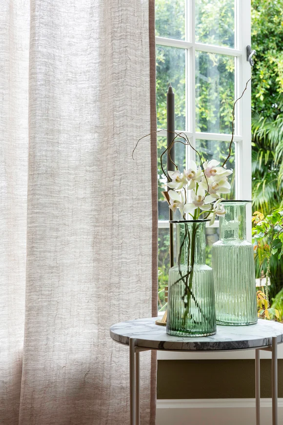
This vision board if for our Ikigai collection, which is really an evolution from La Primavera but with much more of an Asian aesthetic. Our close geographical proximity to Asia and shared love of simplicity, quality, and craftsmanship was a key source of inspiration for the range which celebrate beauty in the imperfection of linen textures and organic wabi sabi weaves.
When designing Ikigai, we were inspired by the modern simplicity of antique Japanese screens. Our hero design is an over scaled watercolour oasis featuring Japanese cranes and the wisteria and peony motifs from La Primavera.
The colour palette elicits a sense of nostalgia as we see neutrals warming up – expect tones of parchment, calico, and cream as well as a resurgence of brown within the interior space. Ikigai also focuses heavily on green hues which elicit a calming energy in interior spaces and encourage us to slow down and be more mindful. You can expect to see all shades of green in our upcoming Ikigai collection.
CONSTRUCTION
CONSTRUCTION
What we see within the textile industry at a construction level is a critical element in our process and also influences the themes of our collections.
We visit two key trade fairs annually, Heimtextil in Germany and Proposte in Italy, where we meet with the majority of our key suppliers. We also travel to mills around the world – as textiles are influenced by their rich history and cultural location – to work on current developments and review the mills extensive archives. Working with these mills is a true collaborative process where we share intellectual property to get the best possible design outcome.
We create a separate vision board of our favourite constructions, qualities, and pattern ideas. These boards are a source of continual inspiration and a critical communication tool for our stake holders.
Initially, the chosen theme can be quite loose with a simple working title which evolves as we move through the development process. As the range takes shape we hone the design aesthetic and fine tune the key messages of the collection, both from a visual perspective and a lifestyle perspective. How we live in Australia and New Zealand sits at the core of our Mokum brand philosophy and our thematic collections always represent this.
For 2020 our designers used a local lens to reinterpret international macrotrends into four inspirational themes for our local and global customers. The popularity of the minimalist design movement is met with a bold, colourful, and tactile theme through maximalism, while calming and nature-inspi...