

"You ought to love colour, and to think nothing quite beautiful or perfect without it." – John Ruskin

Journal

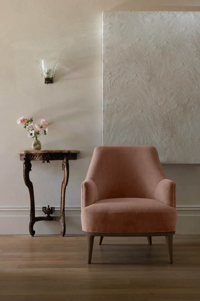
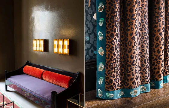
Curtain in Satnin & furniture in Beverly Hills by Catherine Martin by Mokum
Colour trend forecast 2024
Central to our 2024 trend forecast is the application of colour and the treatment of it as an evolving, interactive, living thing. The influence of colour on the mood and atmosphere of a space is so pronounced that simply by altering one colour an undeniable ripple effect permeates across everything else.
Three key palettes will influence our interior spaces in the coming months and, interestingly, each palette complements the next and speaks to the reoccurring macrotrends of nostalgia and escapism, whilst ultimately celebrating creative confidence and creative expression in interior design.
Soft focus
Soft focus
Nods to recent trends including Cocooning, Neo-Traditionalism, and even Cottagecore can be seen in the soft evolution of mid-pastels in our interior spaces. Muted, limewashed iterations of duck egg, apricot, lilac, sage, rosy tan, and musk represent these soothing yet optimistic colours which sit comfortably between primary and pastel shades.
Easily adapting to both traditional spaces – as toile, chinoiserie, or striped designs – our Soft Focus colour palette also fits seamlessly into contemporary interiors. Appearing as a tactile boucle or velvet upholstery, fluid sheer drapery, or high-performance outdoor textile, mid-pastels are not only versatile but an enduring favourite of the James Dunlop and Mokum brands.
In research undertaken by Architectural Digest, 24% of designers selected robin’s egg blue as their preferred shade of blue for 2024, while sage was the preferred shade of green at 26%, surpassing emerald – a favourite for 3-years running. As interior designer Barzilay Freund notes, “we don’t necessarily need that jewel sparkle in our life. We just want softness, which plays into this love of new neutrals. Sage feels a little more timeless.”

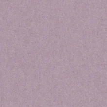


Interior by Glumen Interiors (image sourced from Pinterest) | Aula Wallcovering by Romo (distributed by James Dunlop Textiles in Australia)
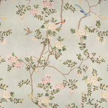
Nourishment
Nourishment
Over recent seasons our beloved neutral palette has warmed and expanded. These rich shades evoke a sense of connection between the soul and the Earth, as we seek a sustainable future and continue to champion nurturing ideas of bringing the outdoors in.
Silver-greys have been replaced by shades with pink undertones such as terracotta, greige, and oatmeal, as well as camel, bronze, molasses, brown-edged greens, and yellowed-creams. These shades pair seamlessly with natural hard materials like timber, stone, glass, and metals such as unlacquered brass.
Complex, chalky textiles with a distinct depth of colour speak to the trend of quiet luxury as textured upholsteries and fluid draperies abound and pair delicately with soft mid-pastel blues and greens to lift an interior.
In Architectural Digest’s research, 21% of designers chose chocolate brown as their preferred colour for 2024, followed by earthy shades of burnt orange and mustard. It is clear that our affinity for the decadent, yet enveloping 1970s palette remains strong across our interior spaces.


Gustavo Neves The Invisible Collection (image sourced from Pinterest) | Mendocino by Designs Of The Time (IMAGE BY TIMOTHY KAYE & BEK SHEPPARD for Arthur G)
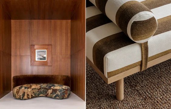
High contrast
High contrast
Vibrant, saturated hues are a celebration of self-expression and creativity in our spaces. Layers of moody aquamarine, martini green, chocolate brown, and plum contrast with pops of chartreuse, palm leaf, and metallic touches in an evolution of the maximalism we have witnessed in recent years.
Tactile textiles such as viscose and wool velvets are known to take colour from dyestuffs much more richly than other fabrics, so we often see more decorative palettes in these substrates. Additionally, connotations of velvet as a luxurious textile contribute to the ongoing desire for lively jewel-tones in velvet.
For contrast, counter-trend earthen-inspired wallcoverings or mid-pastels like Peach Fuzz, Pantone’s 2024 Colour of the Year, present a soft, comforting canvas on which to inject vibrant shades for a unique interior scheme.
Decorative trims add subtle interest or a touch of maximalist glamour to interiors. They can be as simple as a detailed edge on a roman blind or a contrast edge on a sheer curtain, or as bold as a vivid braid, fringe, or tieback which contrasts the rhythm and repetition of a space.


Interior by Dimore Studio (image sourced from Pinterest) | Temperly London x Romo Collection (distributed by James Dunlop Textiles in Australia)
Overall, we’re seeing a blending of palettes and a slow evolution of macrotrends within interior schemes. Soft shades offer delicate optimism, warm neutrals enhance comfort and connection, and rich colours present opportunities to make you space ‘pop’ – as loudly or subtly as you desire.
Textiles have been used to tell stories for millennia but few more so than through the bucolic, floral, cultural, and industrial illustrations of monochrome toile de Jouy. Raspberry red printed onto white or off-white cotton ground dominated 18th century iterations while blue, bisque, purple, and...
