"I think colour is the basis of all my ideas and the way that I think about things" – Amber Armitage

Journal

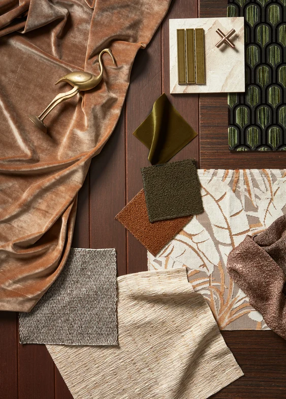
Amber Armitage curating our Soft Focus palette

High Contrast palette styled by Amber Armitage
Q&A | Amber Armitage
Amber Armitage is an all-round creative with an eye for colour. Having started her career as a graphic designer in the editorial space, before selling her own artwork and ceramics, and launching Marigold, her photoshoot styling and production business, Amber employs her many talents on a daily basis.
After styling our 2024 Colour Trend Forecast and bringing our palettes to life, we sat down with Amber to talk careers, curation, and most importantly, colour.
Tell us about your career – what led you to producing and styling home interior photoshoots?
Tell us about your career – what led you to producing and styling home interior photoshoots?
I originally studied a Bachelor of Design which led me to a job at Homestyle magazine where I worked as a graphic designer for eight years. During my time there we started creating editorial photoshoots for the magazine and it was then that I realised I loved being out from behind the computer and working hands on.
I decided to explore working for myself, and along the way I have had a ceramics range, sold my own photographic art prints and paintings, worked on shoots for brands and editorial as well as on residential projects. Last year I rebranded to Marigold, focusing largely on interior shoots – but I am always open to exciting new creative projects and collaborations.
What goes into the creation and execution of a Marigold shoot?
What goes into the creation and execution of a Marigold shoot?
I usually start with the concept or an idea that is based around a colour palette, this could be seasonal or based on future trend forecasting. I read around this topic and find image inspiration from various sources (books, nature, Instagram, Pinterest, etc.) and once I feel like the idea is coming together, I create a mood board and send it to the client.
From here I put together a list of brands or stores where I can source furniture and homewares that might fit the concept and search for products both online and instore, always keeping in mind how these items might fit my ideas for the studio set build. This is where things go back and forth a little bit – do you build the set to fit the furniture and idea, or do you build the set and source furniture to fit? Well, a bit of both. I also need to keep the scale of the set and how the furniture will interplay in mind, and colour – how the colour will work with the space. Then I order all the items and work with the studio to build the set and have the floors laid and the walls painted.
Shoot day is when it all comes together. Working with the photographer to arrange the lighting and decide which angles we will shoot to show off the space, the idea, and the furniture in its best light. Lastly (if it is an editorial shoot) I create the design layout as a reference for the magazine and write an editorial blurb and styling tips for the readers.
There are a lot of steps to creating an interior shoot and it is rarely a linear process; each part affects another, so there is plenty of problem solving to keep you on your toes. It involves creativity and concept, hands on painting, set building, styling, writing, and image selection (there is also plenty of admin and organising).
Nourishment palette styled by Amber Armitage
What role does colour play in your life and work?
What role does colour play in your life and work?
I think colour is the basis of all my ideas and the way that I think about things. Firstly, there is a colour or a palette, secondly there is texture, and thirdly is editing out what does not work in this combination. I think this is true for how I process anything visual; I walk into a room and can feel immediately comfortable or uncomfortable because of how things work (or don't work) together.
Which colours or colour combinations are you particularly drawn to? Do your favourites differ over time or are they constant?
Which colours or colour combinations are you particularly drawn to? Do your favourites differ over time or are they constant?
Ooh tricky question. I don’t think I have a favourite colour combination as such – although I will forever love earthy, dusty pinks and warm terracotta. I think what I am drawn to is the execution of a colour palette in the right space and in the right proportions. All colours can look absolutely stunning or absolutely awful, the real success lies in the proportions, how the colours play off each other, and how it all looks within the space.
How do different applications of colour influence the way we interact with private or public spaces?
How do different applications of colour influence the way we interact with private or public spaces?
I believe colour and the treatment of interior spaces has a huge effect on our mood and our mental health. Some people are more sensitive to this and can feel instantly relaxed or uncomfortable in a space, while for others it might be more subconscious or has a lesser effect on them. I think things are deeply ingrained in us which affect how we respond and react to both interior and exterior spaces. As always, nature does it best. There are different colours in different seasons, there is both chaos and harmony, but everything is in sync.
Do you have any advice for people who would like to be braver with colour, but aren’t sure where to begin?
Do you have any advice for people who would like to be braver with colour, but aren’t sure where to begin?
You can only learn what you like by trying it out, so try lots of things. Get fabrics, paint test pots, and wallpapers and see what you are drawn to. A good place to start could be your wardrobe; a lot of people are more comfortable being creative or confident in their wardrobe than in their interior. Start there and see if there are any colours that you are really drawn too, then try them out in your interior by literally hanging your dress on the wall and see how it feels.
Washes of soft colour, artistic mark-making, and biophilic themes have become synonymous with New Zealand designer Emma Hayes’ wallcoverings. Following career-highlights such as producing wallcoverings for the Louis Vuitton retail stores in Auckland and Melbourne, and ahead of our own collaborati...
